|
|
|
Installing
AstroPan When the installation has completed successfully, AstroPan will appear in your Start / Programs group.
Please direct any persistent installation problems to me with as much
detail as possible about the errors encountered. |
|
Program Menus |
|
|
|
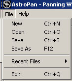
File
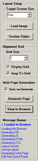
Menu New- Will load the default layout. The Default layout is a bare layout with all textboxes switched on, frames turned off and colours set to white on black. The AstroPan default layout cannot be overwritten, but it can be copied by saving a version with a different name (see Save As below).
Open- Open an existing AstroPan layout file (*.APL).
Save As- Save the current layout with a different filename. If the new layout is in a different directory to the original, web pages for the new layout will generate into the new location.
Recent Files - Select from a top-down list of the last 16 Layout files opened/saved.
Exit- Exit AstroPan. The current state will be restored when AstroPan is restarted. |
|
|
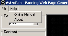
Help Menu
Online Manual - Will load this document from the AstroShed website. The online version will always be up to date and needs an internet connection to be accessed.
About - Will show the
AstroPan About Box, including the AstroPan version number. |
|
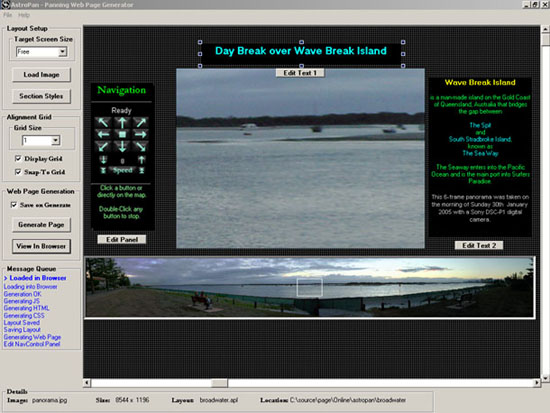
of the Web
Page Layout. Each editable component is referred-to as a "Section".
The complete layout is accessible by using the Layout Scrollbars.
Different sections have different editable properties. these are explained further in the section below
|
|
Changing the Layout |
|
|
Moving Objects in the Layout |
Sizing Objects in the Layout |
|
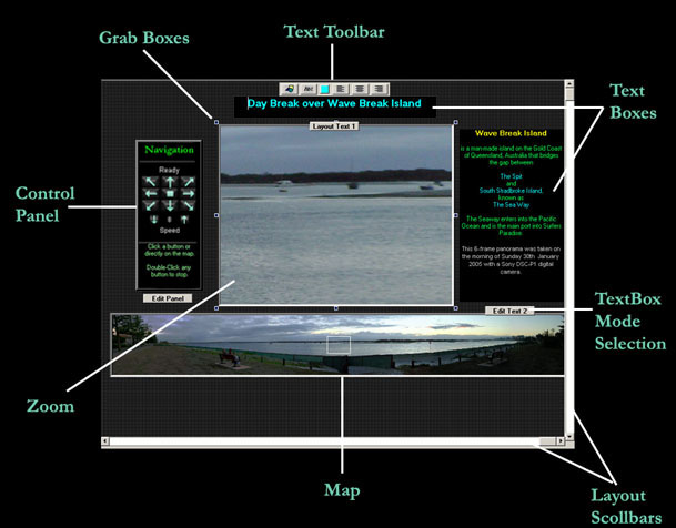
Any object in the layout window can be moved by clicking anywhere inside it and dragging with the mouse.
Text boxes must be in Layout mode to be moved. Text boxes always start out in Layout mode and switch to Edit mode, when the Textbox Mode Selection button beneath it is clicked. Clicking the button again will return the Text box to Layout mode.
All Sections can be placed randomly throughout the Layout.
The layout window will resize itself to suit if a Section is moved outside the current layout window. |
To change the size of a Section, click within it to display the Grab Boxes around the border. Click and drag a grab box to resize the object. All Sections are resizable except for the Navigation Control Panel which is a fixed size. The Map window is designed to always show the entire image so in order to maintain the aspect ratio, sizing of the map window can only be done in the Horizontal axis by dragging one of the grab handles on the vertical side of the Map frame. |
|
Windows Editing Keys Ctrl+A - Select All Ctrl+X - Cut Ctrl+C - Copy Ctrl+V - Paste Ctrl+Home - Select to Start of line Ctrl+End - Select to End of line The mouse can also be used to select blocks
of text by clicking and dragging the cursor. |
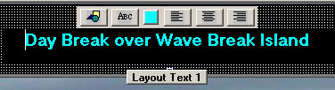
To Edit text, click the "Edit Text" button
beneath the Textbox you want to edit.
A toolbar will appear above the textbox and the button name will switch to "Layout Text" as in the example above.
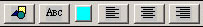
The text boxes are Rich Text boxes with all of the associated functionality. The standard Windows editing keys apply for editing text in a Rich Text Box (left) and they can contain multiple paragraph formatting, font styles and colors.
The Text Toolbar buttons from left-to-right are:
Section Style - This option is the same as pressing the Section Style button in the layout Controls, except the relevant Section is highlighted. Font/Style - A standard windows Font dialog allows selection of any Font, size and style (bold or italic). AstroPan defaults all fonts to San Serif in the generated web page in case a selected font is not available to a visitors browser. Font Color - The current font color under the cursor is shown in the small box. The color can be changed at any time to any other color by clicking the color box. Left, Centre, Right Justify - Clicking any of the justification boxes will justify the current paragraph unless more than one paragraph is highlighted. |
Section
Styles
Frames and Background Colors |
|
|
|
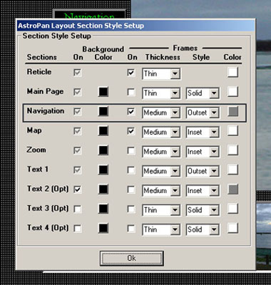
This window can be accessed by clicking the Section Styles button in either the Layout Setup Panel or a Text Toolbar. From here you can change the background color of any section in the layout including the main page, turn borders on or off for any section and change the border style and color. Changes are applied instantly to the layout so you can see what they look like. Some restrictions apply Section On/Off - Only applies to the three optional Text Sections. All other sections are defaulted to On and cannot be turned off. Reticle - is actually a frame so its Frames cannot be turned off though its color and thickness can be changed. Main Page - Cannot have a border applied. In this example, optional textboxes 3 and 4 are switched off, and frames are applied only to the Navigation Control and Map Sections. |
|
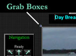
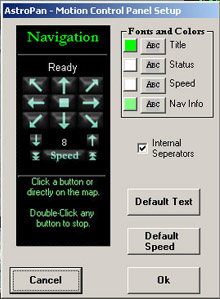
Navigation Control Panel Setup |
|||||||||
|
This window can be accessed by clicking the Edit Panel button underneath the control panel in the layout
window. The Control Panel contains all of the controls for navigating the Map and can be customised to a large degree except for size and placement of the panel sections.
The panel itself is fixed-size and consists of five main sections. All text fonts and colors can be changed by clicking the appropriate font or color button in the Fonts and Colors box. The Background color and frame of the Navigation panel can be set from the Section Style window covered above.
Navigation Information - This panel contains some instruction on how to use the Control Panel. The Text, font, font-size and color can all be changed but the size of the block itself is fixed, so care is needed to not overflow the panel. |
|||||||||
|
The Details Panel contains information relating to the current layout.
|
||||||||||||
|
|
Tips |
|
|
Create your own layout template |
You can easily create your own layout template by setting up
the Sections that you want, with whatever common content you want and
saving it somewhere. You can then load this layout and use it as as the
starting point for future layouts by loading a new Image and adding or
modifying the relevant text.
Be careful not to overwrite the template when creating your new layouts from it. Of course any layout can be used as a template for new pages. |
|
Optimise the Zoom Window size to the base image |
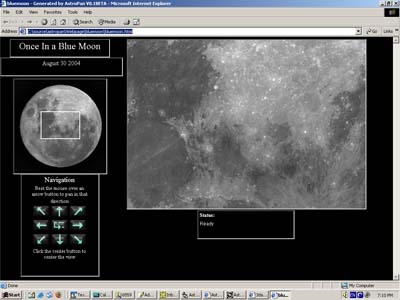
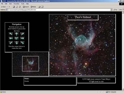
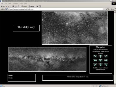
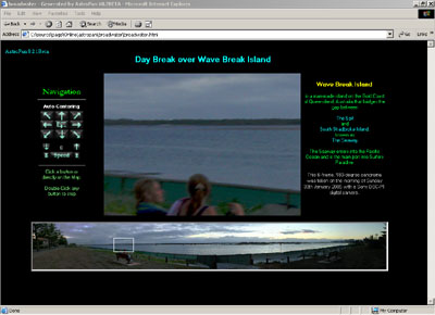
The idea behind AstroPan is to allow easy navigation around a high-resolution image. The image can be whatever size you like but the best results are when you choose a Zoom Window size at least roughly matched to the scale of the detail in your full-sized image that you want to be wholly visible. |
|
Be Careful with Web Editors |
Although AstroPan-generated pages can be loaded and modified
with any web editing software, AstroPan will not recognise these changes
if you try to load the Layout again.
AstroPan only knows about the parts of the layout that it has created and so will not display external changes and will overwrite them if the page is regenerated . |